Visualizations | Graphs and Charts
These include statistical and scientific graphics drawn using data collected by our rich network of River Gauge Stations. Typically, although every chart and graph is unique in it's own way, all charts and graphs you are likely to interact with in this website have a general look and feel as highlighted below.
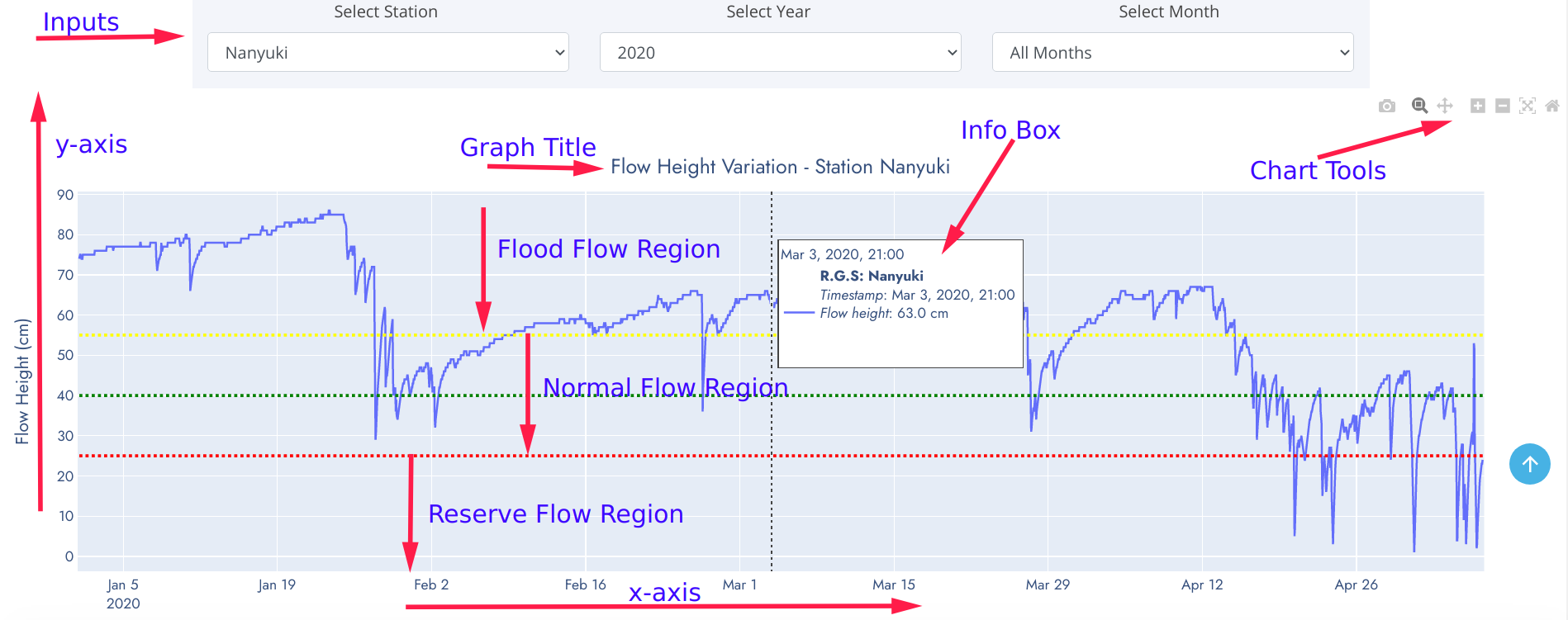
- Inputs - These are data parameter options used to dynamicallly refresh graphics based on selected criteria. The input choices have been robustically linked to automatically adjust accordingly.
- y-axis - Data variable plotted on the positive vertical axis of cartesian plane.
- x-axis - Data variable plotted on the positive horizontal axis of cartesian plane.
- Chart Title - A brief descriptive text detailing contents and type of the graph. Forms a very useful information information when interpreting the graphic.
- Info Box - Information panel detailing observation value at pointed position of the graph. This eliminates traditional practice of approximating values on graph.
- Flow Regions - Regions defined by water flow height thesholds for a specific river profile.
- Chart tools - These are toolsets included on every graph. They enable a user to zoom-in, zoom-out, move the graphic along axes, compare data points and/or save to local computer for embending on reports, journals etc.
Graphics on this website are cartegorised into three groups namely:
- Pairwise Relationship (Flow Pattern) Charts
- Univariate Distribution Charts
- Comprehensive Gallery
Pairwise Relationship (Flow Pattern) Charts
Composed of Line Graph, Heatmap, and Contour Plot.
Line Graph
A line graph is a very common and powerful graphic for timeseries data analysis used to document changes over time. It consists of a horizontal x-axis and a vertical y-axis. Data points are plotted and connected by a line in a "dot-to-dot" fashion. The x-axis is called the independent axis because its values do not depend on anything while y-axis is called the dependent axis because its values depend on those of the x-axis. More than one line may be plotted in the same axis as a form of comparison. Movement of the line up or down helps bring out positive and negative changes, respectively. It can also expose overall trends, to help the reader make predictions or projections for future outcomes. The key to interpreting a line graph is to look at the title and the labels, especially if there is a legend. Interpreting a line graph data is:
- Making sense of the given data
- Answering queries about the data
- Making predictions on trends
- Finding value of one variable given the value of the other and so on.
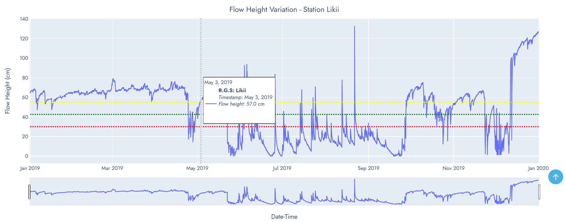
The line graph above shows pattern and trend of water flow height of Likii in 2019. It's evident that water flow was slightly above flood level threshold but gradually dropped to reserve flow in April 24. The drop lasted for five (5) days and water level rose again. This behaviour may be considered an anomaly that requires further investigation of the cause.
Heatmap Graphic
Heat maps are a great tool for visualizing complex statistical data. A heat map is data analysis graphic that uses a warm-to-cool color spectrum to show which parts of a data space receive the most attention. The variation in color may be by hue or intensity, giving obvious visual cues to the reader about how the phenomenon is clustered or varies over space . You can think of heatmap as a form of visual storytelling.
A heatmap gives extreme colors to extreme values so they are easily visible to the naked eye. Apart from that, it's just a matrix of numbers, no special interpretation is required. Creating a heat map helps you understand an observation behavior instantly.
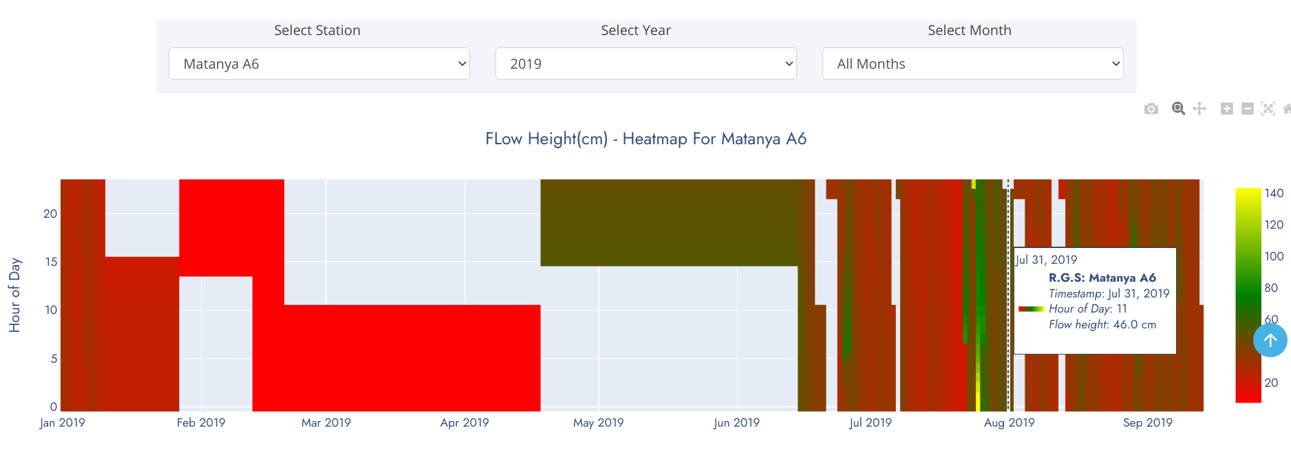
The heatmap above show water level pattern for Matanya in 2019. Unshaded regions represent sections of the observation period where data wasn't relayed by monitoring sensors. A general overview of the heatmap tells that water level was below 60cm for the best part of the year except in late July where spikes were observed.
Univariate Distribution Charts
Composed of Box-and-whiskers plot, Distplot and Violin Chart.
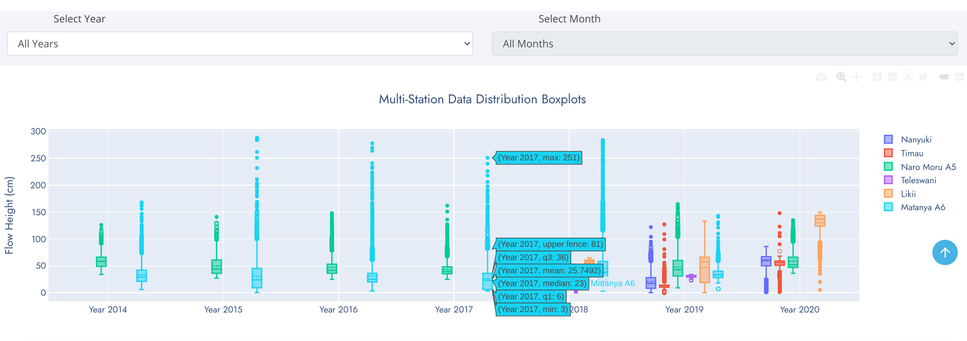
Boxplot
A box-and-whisker plot is an exploratory graphic, used to show the distribution of a dataset (at a glance). They are best used at the beginning of data analysis to identify early patterns in the data. They are very useful for reporting results in clear and concise ways. One exciting thing about box plots is that they contain every measure of central tendency in a neat little package. Recall that the measures of central tendency include the mean and median. It also shows a few other pieces of data.
Reading a Box-and-Whisker Plot
- The box (green colored region) - represents 50% of data points between Lower and Upper Quartiles.
- Mean - denoted by dotted line in the box. Represents average observation (sum/total-observations).
- Median (middle quartile) - marks the mid-point of the data (50% of data falls above/below this value) and is shown by the solid line that divides the box into two parts.
- Lower quartile (Q1) - 25% of data falls below this value. Shown by lower edge of the box.
- Upper quartile (Q3) - 75% of data falls above this value.
- Whiskers - The upper and lower whiskers represent values outside the middle 50%. Upper Fence - formed by upper whisker - represents the maximum value exluding outliers while the Lower Fence - formed by lower whisker - represents the minimum value excluding outliers.
- Outliers - data points that fit well outside the pattern of a data sample. In statistics, an outlier is an observation point that is distant from other observations. Can be considered as noise in the data caused by a mistake during data collection, drastic changes in the observation (spikes) etc.
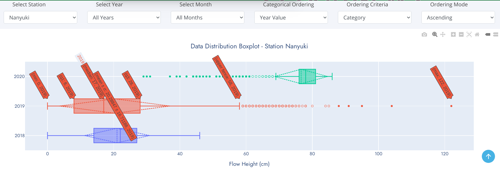
Data Skew
With box-and-whisker plots, you can also see which way the data sways. For example, if there are is a tendency to more rainy days over sunshine in a given month, the median is going to be higher or the top whisker could be longer than the bottom one. Basically, it gives you a good overview of the data distribution.
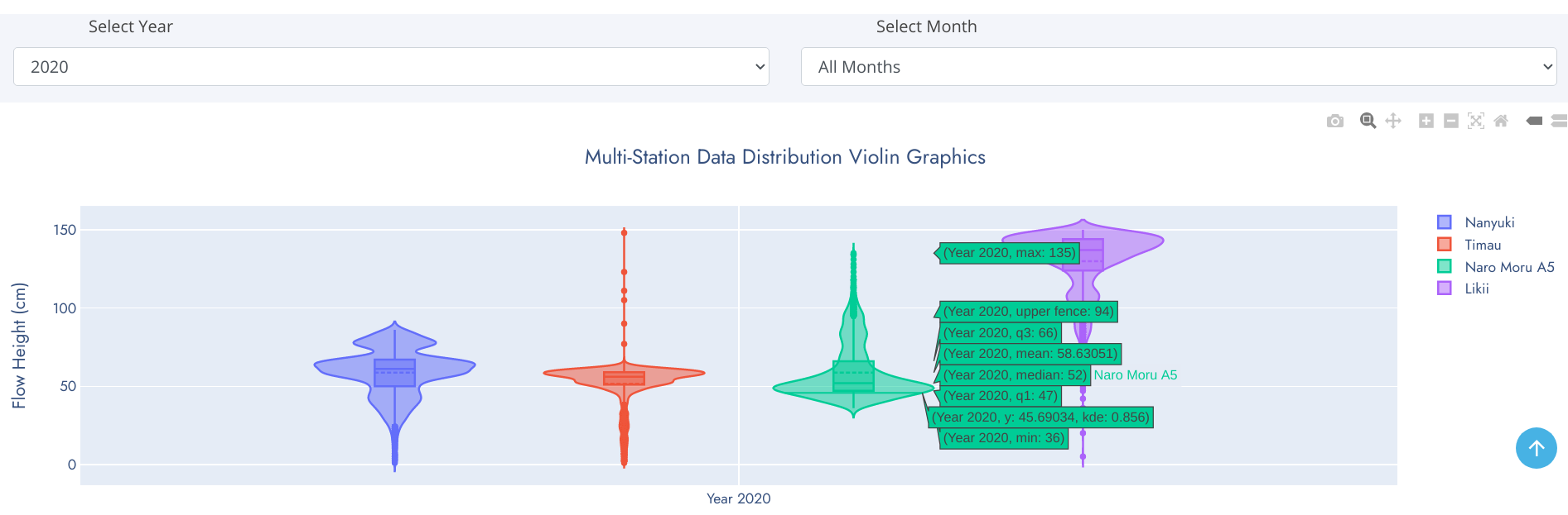
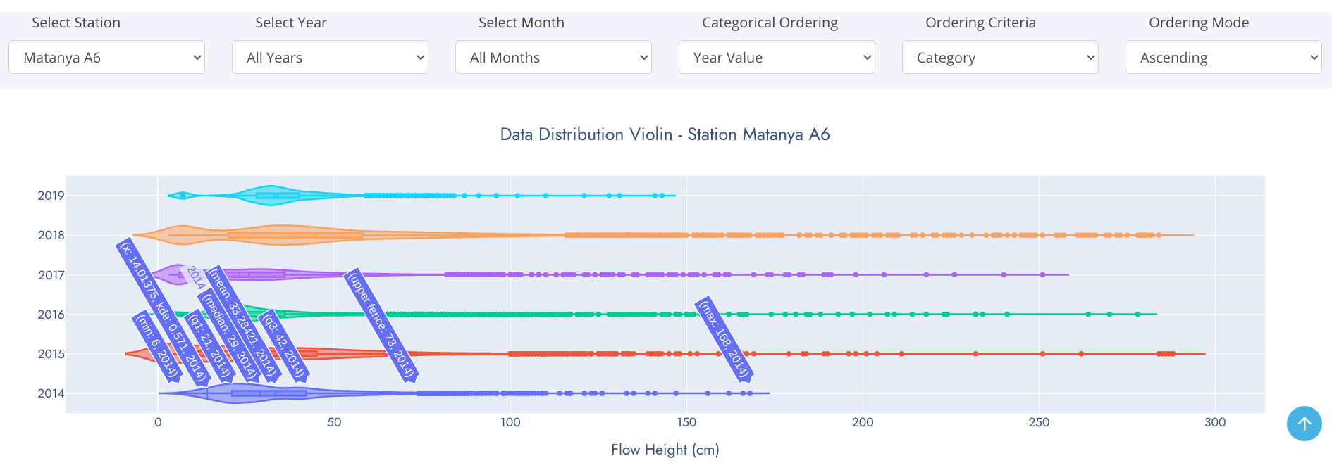
Violin Chart
Violin plots are similar to box plots except that they also show the probability density of the data at different values, usually smoothed by a kernel density estimator. Typically a violin plot will include all the data that is in a box plot: a marker for the median of the data; a box or marker indicating the interquartile range; and possibly all sample points, if the number of samples is not too high. Unlike box plots, a violin plot depicts distributions of numeric data for one or more groups using density curves. In a violin plot, individual density curves are built around center lines, rather than stacked on baselines. Other than this difference in display pattern, curves in a violin plot follow the exact same construction and interpretation. The width of each curve corresponds with the approximate frequency of data points in each region. Densities are frequently accompanied by an overlaid chart type, such as box plot, to provide additional information.
The box-and-whiskers represents the usual boxplot, except for points that are determined to be outliers using a method that is a function of the interquartile range.
On each side of the boxplot is a kernel density estimation to show the distribution shape of the data. Wider sections of the violin plot represent a higher probability that members of the population will take on the given value; the skinnier sections represent a lower probability.
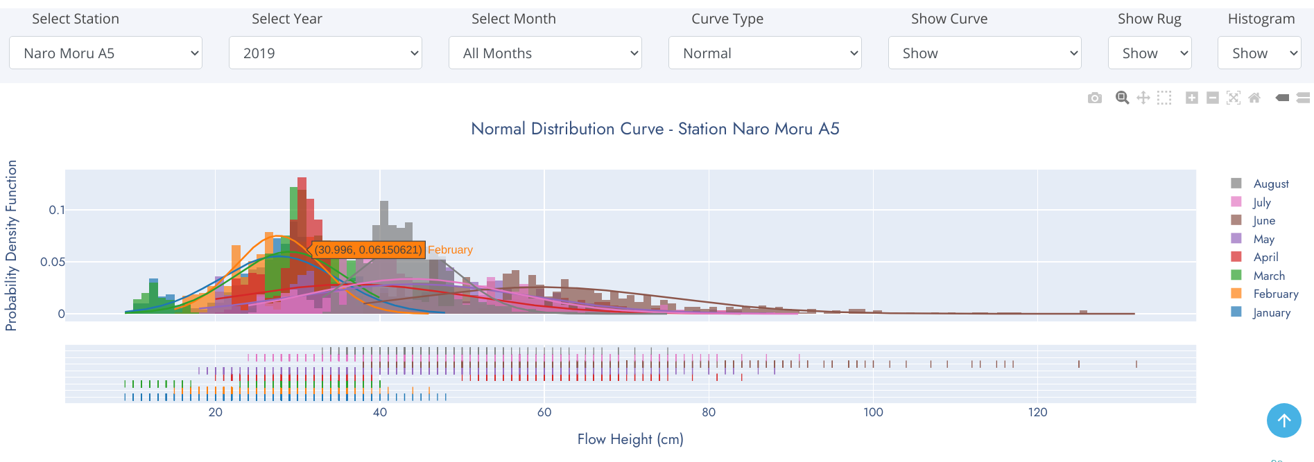
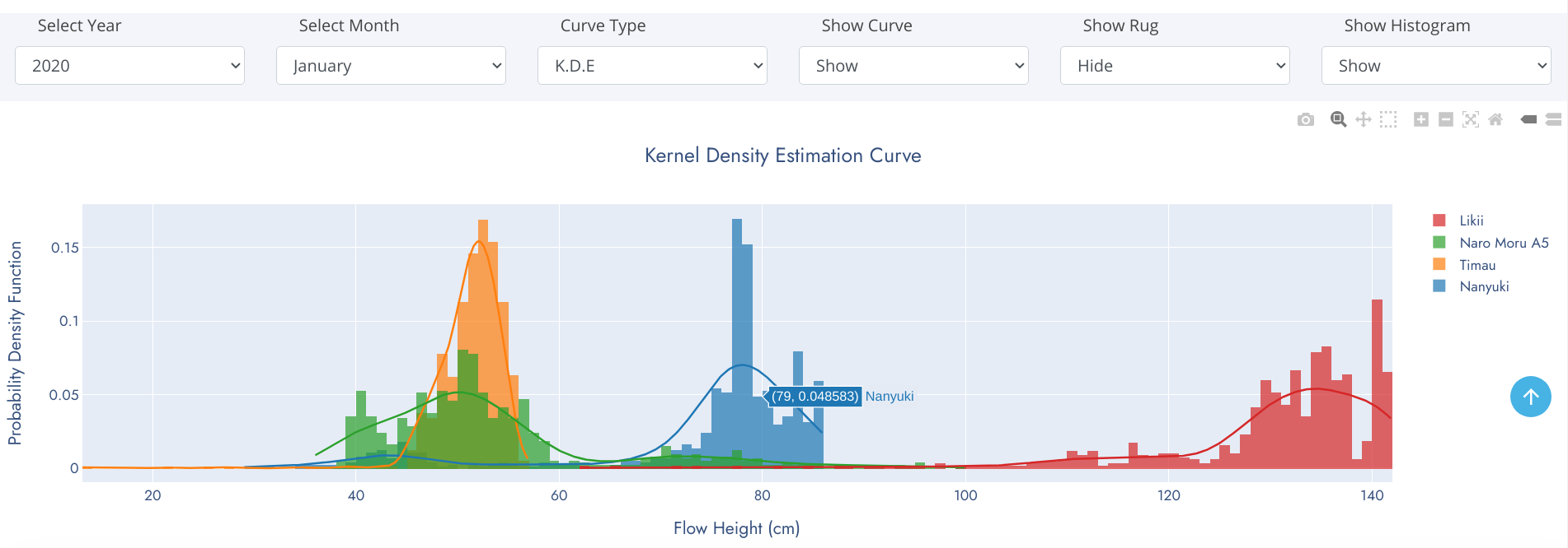
Distplot
We frequently encounter the situation where we would like to understand how a particular variable is distributed in a dataset. Plotting a single variable seems like it should be easy. Using a Histogram, we can easily achieve this. A histogram divides the variable into bins, counts the data points in each bin, and shows the bins on the x-axis and the counts on the y-axis.
Histograms are a great way to start exploring a single variable drawn from one category. However, when we want to compare the distributions of one variable across multiple categories, histograms have issues with readability. A density plot and rug comes to rescue of histogram at this point.
A distplot is a combination of histogram, density plot and rug. A density plot is a smoothed, continuous version of a histogram estimated from the data. The most common form of estimation is known as kernel density estimation. A rug plot is simply a projection of raw data points onto a particular axis, without involving the binning process of a histogram.
Comprehensive Gallery
This is the most confusing and complex component of the graphics on this website. The statistical, scientific and technical information required to interpret these graphics can only be acquired from domain expertise. These charts were developed for scientific and research purposes to aid seamless comparison betwen stations from a common baseline observation period (year(s) or month(s)). However, this should not be misunderstood to mean direct comparison of water flow at varios stations on different river profiles because these river profiles are of different widths and water in them travel at differents speeds. We are working on measurement of river width and water flow speed at the RGS point to derive a common base of comparison (river discharge).
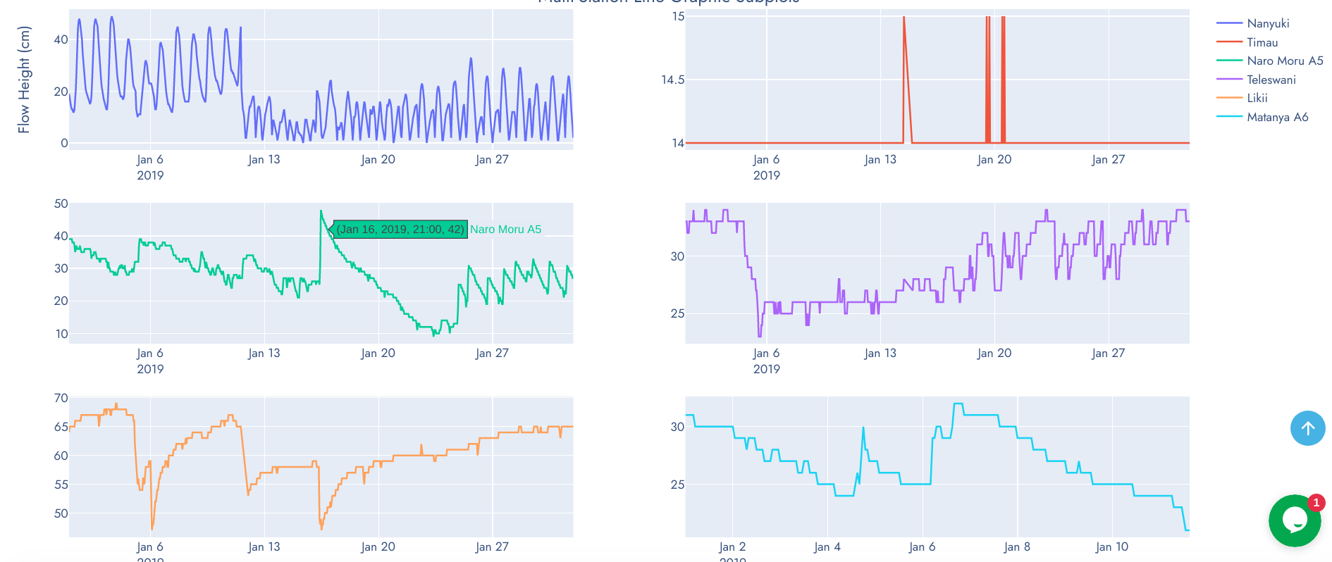
Graphics in this category are composed of Line Graph Subplots, Grouped Boxplots, Multi-Station Distplot and Grouped Violin Plots.
Line Graph Subplots
Grouped Boxplots
Multi-Station Distplot
Grouped Violin Plots